
Every engineering leader eventually gets the question from a CFO or a board member: how do we know developer productivity is actually improving? The honest answer is that developer productivity was never a single number to begin with. The metrics most teams default to first — commits, lines of code, story points closed — measure activity, not outcomes. Reach for the wrong developer productivity metric and a team optimizes for shipping more of the wrong thing, faster, while the underlying engineering system quietly gets worse.
That’s not a reason to give up on measurement. It’s a reason to be more deliberate about which signals actually correlate with the outcomes leadership cares about: faster delivery, fewer incidents, engineers who stick around, and software that keeps working under load. The organizations getting this right in 2026 tend to treat measurement as a system of complementary signals rather than a single scoreboard, and they’re able to explain to a CFO exactly why each one earns its place. Six developer productivity metrics from 2025 and 2026 research hold up under that scrutiny, and none of them work in isolation.
Deployment frequency only means something alongside lead time
Deployment frequency is the metric every dashboard already has, and it’s also the one most often reported in isolation. On its own, a high deploy count says nothing about how effectively a team is actually working — a team can ship constantly and still be dragging out an incident from three releases ago, or quietly accumulating rework it hasn’t accounted for yet. The current guidance from the DORA research program (updated January 2026) pairs deployment frequency with change lead time and failed-deployment recovery time as a throughput trio, then balances it against a second, equally weighted pair covering how often changes fail and how much rework they require.

The finding that should reshape how leadership reads these dashboards is that speed and stability are not a tradeoff at the high end of performance. Teams generating the most reliable throughput signal tend to score well across all five metrics simultaneously, not fast at the expense of stable or the reverse — a pattern that holds up across company size and industry in DORA’s own longitudinal data. For teams building the underlying release mechanics that make this pairing possible, a structured, versioned pipeline is what turns deployment frequency from a vanity number into something that can actually be trusted alongside its stability counterparts.
The throughput trio measures how fast code moves
Change lead time tracks the gap between a commit and it running in production. Deployment frequency counts how often that happens. Failed-deployment recovery time measures how quickly a team restores service after something breaks. Together they describe pace, not just volume — a distinction that matters when a board asks about developer productivity and gets handed a chart that only shows the third metric.
The instability duo measures what breaks along the way
Change fail rate and deployment rework rate describe the cost of that pace. A team that pushes deploys constantly but reverts a third of them isn’t demonstrating real engineering output, it’s demonstrating churn dressed up as speed. Reading the instability pair next to the throughput trio is what separates teams actually improving from teams that just got faster at breaking things. Where a team hosts additional nearshore engineering capacity to keep this pipeline staffed, the same five-metric discipline should travel with them rather than resetting per location — otherwise the dashboard just tells two different stories depending on which team is looking at it.
Speed and stability aren’t actually competing goals
If the first signal establishes that deployment metrics need a partner, the second is about which partner to pick. No single measurement framework captures developer productivity end to end, which is why the DORA research team’s own 2025 guidance recommends combining frameworks rather than picking one. SPACE covers satisfaction, performance, activity, communication, and efficiency. DevEx focuses on flow state and cognitive load. HEART was built for product usability, not engineering, but its structure still transfers well to internal developer platforms.
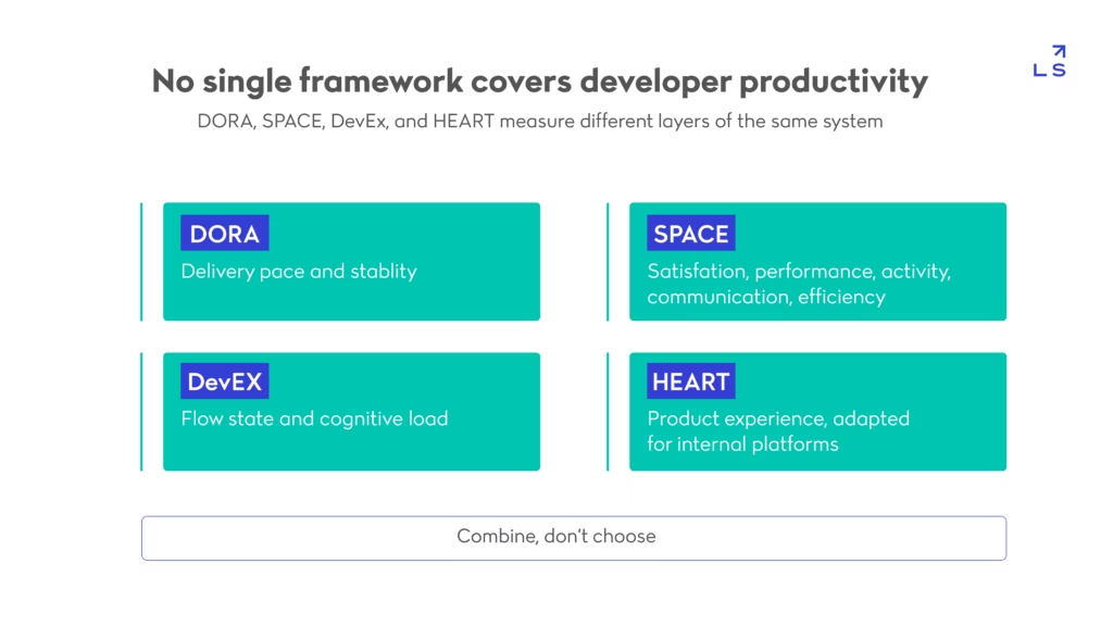
The practical reason to combine rather than choose is that each framework is blind to what the others measure. A team can score well on DORA’s throughput metrics while quietly burning out the engineers producing them, and a satisfaction survey alone won’t catch a pipeline that’s technically fast but architecturally fragile. Frontend teams already apply this same combine-don’t-choose logic operationally: a performance budget enforced in CI is effectively a guardrail against exactly the kind of drift a single framework would miss until it was already a user-facing problem.
No single framework captures the whole picture
DORA is strong on delivery pace and stability. SPACE and DevEx are stronger on the human side — whether engineers are actually able to do focused work. Treating any one of them as the productivity metric, singular, guarantees a blind spot somewhere else in the system, and that blind spot is usually the one that shows up in an exit interview six months later.
AI-assisted velocity raises the stakes for combining frameworks
The 2025 guidance flags something specific to this moment: short-term velocity gains from AI-assisted coding can look positive on a dashboard while eroding quality in ways that only show up months later. That’s a strong argument for measuring developer productivity across frameworks rather than watching one number tick upward and calling it progress.
Shipping culture has shifted toward constant, smaller iterations
Developer productivity metrics only make sense against the backdrop of how software actually gets shipped now, and that backdrop has moved. GitHub’s Octoverse report, published in November 2025 and covering the prior year, counted 986 million commits pushed across the platform, with more than 230 repositories created every minute and 11.5 billion minutes of GitHub Actions running tests — a 35% increase year over year. Smaller, more frequent pull requests have become the norm rather than the exception, and feature flags now function as core infrastructure for shipping incomplete work behind a toggle rather than waiting for a release window.
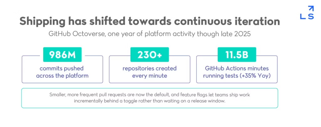
That shift changes what a healthy developer productivity number looks like. A team merging small changes dozens of times a day isn’t necessarily faster than one merging weekly — it’s operating under a different unit of work entirely, and comparing raw counts across the two is close to meaningless without normalizing for size first. Systems built around this cadence increasingly favor coordination through asynchronous event flows rather than tightly coupled synchronous calls, which is as much an engineering-output decision as it is an architectural one — it determines how many teams can ship independently without blocking each other, and how much of the merge cadence GitHub is now measuring is actually real parallel work rather than one team waiting on another.
Smaller pull requests are becoming the default
Smaller diffs review faster, cause fewer merge conflicts, and isolate failures to a narrower blast radius when something does break. Counting pull requests without accounting for their size tells you almost nothing useful about developer productivity on its own.
Feature flags decouple deploying from releasing
Once a flag separates the act of deploying code from the act of exposing it to users, deployment frequency stops being a risk signal and becomes closer to a pure throughput indicator, since a bad flag flip is far cheaper to reverse than a bad deploy. Engagements that lean on external outsourced engineering capacity to keep pace with this cadence still need that same deploy-versus-release separation built in from day one, not retrofitted later once the flag count has already gotten out of hand.
Perceived productivity catches what system logs miss
System-of-record metrics like deployment frequency and lead time describe what already happened. They don’t explain why an engineer spent an afternoon fighting a flaky test environment instead of shipping a feature, and that gap is exactly what perceptual measurement is built to close. DX’s Developer Experience Index, built from surveys across more than 40,000 developers and 800 organizations, found that each single point of improvement in the index correlates with roughly 13 minutes saved per developer per week — about 10 hours a year once compounded across a team.
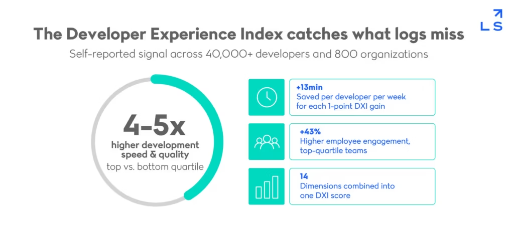
The gap between top-quartile and bottom-quartile teams is where the developer productivity case gets hard to ignore: organizations scoring in the top quartile on this index report engineering speed and quality four to five times higher than bottom-quartile teams, along with meaningfully higher employee engagement. The index itself spans fourteen separate dimensions, which is the point — a single composite score would just reintroduce the same blind spot that made deployment frequency alone unreliable. Getting the underlying signal right often depends on actually being able to see what’s happening inside a system in the first place, which is what makes an observability standard a quiet prerequisite for measuring developer productivity honestly rather than a separate concern.
A single point score hides which of 14 dimensions is dragging
An aggregate developer productivity index score can sit flat while individual dimensions move in opposite directions — flow state improving while tooling frustration worsens, for instance. Leaders who only track the headline number miss the dimension actually driving the trend.
Self-reported data works because developers notice friction first
Engineers feel a slow build pipeline or a confusing deploy process well before it shows up in any lagging system metric. That’s not a weakness of self-reported experience data, it’s the reason perceptual measurement catches problems earlier than the dashboards built purely from logs, sometimes by weeks.
AI adoption metrics separate real throughput gains from hype
Every engineering organization is now being asked whether AI tools are actually improving developer productivity, and most teams don’t yet have a rigorous way to answer that. DX’s framework for this specific question breaks the measurement into three dimensions — utilization, impact, and cost — rather than one adoption percentage. Applied at scale, it produced concrete results: a 16% increase in engineering throughput after one travel company rolled AI tools out to more than 3,500 engineers, while a separate customer-messaging company saw a 41% increase in AI-driven developer time savings largely by nearly doubling how many engineers actively used the tools they’d already been given.
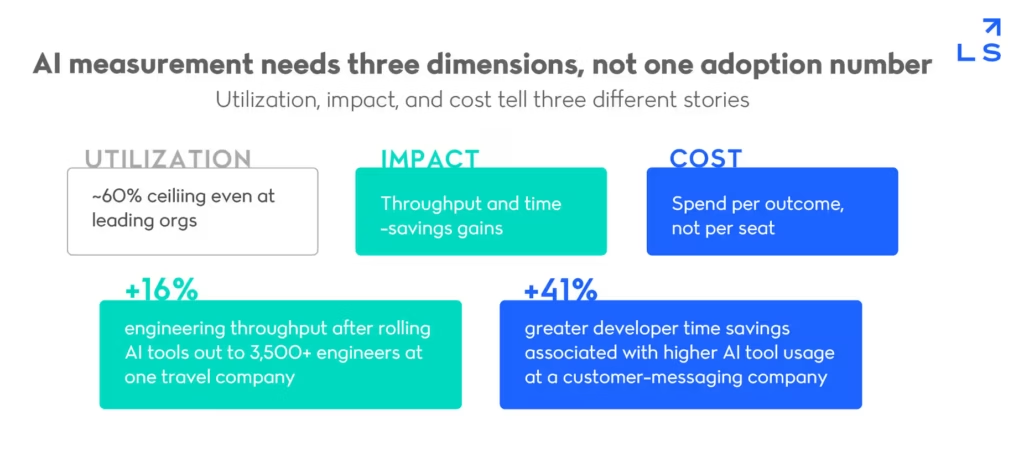
That utilization gap is the detail worth sitting with: even organizations considered leaders in this space plateau around 60% active usage of the AI tools available to them, meaning adoption curves still have real room to run before developer productivity gains from AI fully show up in the numbers.
That same utilization gap shows up in how organizations manage AI tooling more broadly, not just code assistants: rolling out access to a team is a different milestone from that team actually trusting the tool with real work, and the two get conflated in almost every internal AI usage report.
Individual developers show a similar pattern: most report using AI for a majority of their daily work while trusting it to run fully unsupervised on only a narrow slice of tasks, which is its own argument for measuring impact rather than assuming adoption equals output. For organizations formalizing how outsourced and in-house teams jointly measure this, centralized IT services oversight is often what keeps AI-tooling metrics consistent across every vendor and team touching the pipeline.
Utilization, impact, and cost tell three different stories
A tool can be widely adopted and still deliver poor return if it’s used shallowly. Measuring only utilization overstates developer productivity gains; measuring only cost understates them. All three dimensions have to move together before an AI investment can be called a genuine productivity win.
Adoption at the individual level requires care, not leaderboards
DX’s own guidance is explicit that AI usage metrics should not feed individual performance reviews, since doing so invites gaming and quietly discourages the honest experimentation that improves developer productivity for everyone else on the team.
Chasing a single number is how metrics get gamed
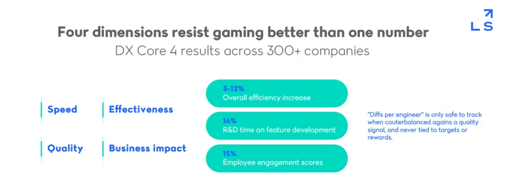
Every developer productivity metric on this list can be gamed if it becomes the target instead of the signal, and few examples make that clearer than “diffs per engineer.” DX’s Core 4 framework, which unifies DORA, SPACE, and DevEx into four dimensions — speed, effectiveness, quality, and business impact — is explicit that diff counts are only useful when counterbalanced against a quality signal like the Developer Experience Index and never tied directly to targets or rewards.
Applied across more than 300 companies, the combined framework produced a 3–12% overall efficiency increase, a 14% rise in time spent on feature development, and a 15% improvement in engagement scores — gains that came from watching four dimensions together, not from optimizing any single one of them.
The underlying risk has a name: Goodhart’s law, the well-documented pattern where a measure stops being useful the moment it becomes a target. Developer productivity is especially exposed to this because so many of its component metrics are trivially easy to inflate — more commits, smaller diffs, faster merges — without any of it reflecting real output. The fix isn’t fewer metrics, it’s metrics that are structurally resistant to gaming because no single one of them can be optimized in isolation without the others exposing the tradeoff.
Diffs per engineer only works with a counterweight
A rising diff count paired with a falling Developer Experience Index score is a warning sign, not a win. Read alone, diffs per engineer tells a story that flatters whoever is being measured; read against a quality counterweight, it tells the truth.
Speed, effectiveness, quality, and business impact resist gaming as a set specifically because they pull in different directions when something is actually wrong. That tension is a feature of measuring developer productivity honestly, not a flaw to be engineered away.
What this means for measuring developer productivity in 2026
None of these six signals is a replacement for the others, and that’s the actual finding underneath all of them: developer productivity was never going to reduce to one dashboard tile, no matter how tempting that would be for a quarterly review. The throughput and stability metrics from DORA describe the delivery system. The Developer Experience Index and combined frameworks describe the humans running it. AI-adoption metrics describe whether new tooling is actually paying off or just generating activity. Read together, they give leadership something closer to the truth than any single number ever could, and they give an engineering team a shared vocabulary for defending its own roadmap instead of arguing over anecdotes.
Here’s the full checklist to properly measure developer productivity:
- Pair deployment frequency with lead time and recovery time, never alone.
- Combine DORA, SPACE and DevEx instead of picking just one framework.
- Normalize shipping-cadence metrics for pull request size, not raw counts.
- Track the developer Experience Index alongside system-of-record data.
- Measure AI tools on utilization, impact, and cost, not adoption alone.
- Counterbalance any single metric before it becomes a gamed target.
Building the measurement discipline to track all of this — and the engineering capacity to act on what it shows — is exactly the kind of work worth getting outside support for. Landskill’s team can help set up the pipelines, observability, and staffing model that make developer productivity something you can actually see clearly, not just estimate at the end of a sprint.